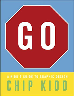
"GO: A Kidd's Guide to Graphic Design" by Chip Kidd
Kidd, Chip. (2013). GO: A Kidd’s Guide to Graphic Design.
New York, NY: Workman Publishing Co. ISBN: 978-0-7611-7219-2
This
might be the most user-friendly book I’ve ever seen. The pages have a pleasant
weight to them. The colors are very well utilized to emphasize a point without
being overwhelming. The fonts are chosen for specific purposes and then explained
in each font.
It doesn’t
go into an extreme amount of detail on any one aspect of graphic design, but it
does a very good job of covering the bases for a young reader who is curious
about the topic, or career field. It
could also be used for project research and has a great timeline for the
development of graphic design that shows how it has evolved. There is a LOT of
information in this book. Just the images of various levels of DPI (dots per inch)
were enlightening to me.
Looking
at the MANY images in the book was really fun because I recognized quite a few
of them! What I never realized before, however, was how much thought really
went into each aspect of the image. The font choice and size, colors, DPI,
shadow, etc. It was really interesting to read about the thought process behind
these image choices and I think that’s a valuable thing for young readers to
learn because it teaches them about how the reader/viewer draws inferences from
images and text.
Buy
this Book (until I hyperlinked this, I didn’t realize the book was actually
titled “Go”)
More by Kidd (even
his website is visually delightful)


Comments
Post a Comment